Ritual
I ride every morning on my Zwift trainer. Monday recovery, Tuesday hard, Wednesday light but long, Thursday hard, Friday steady, long rides on the weekend. FTP test every six to eight weeks.
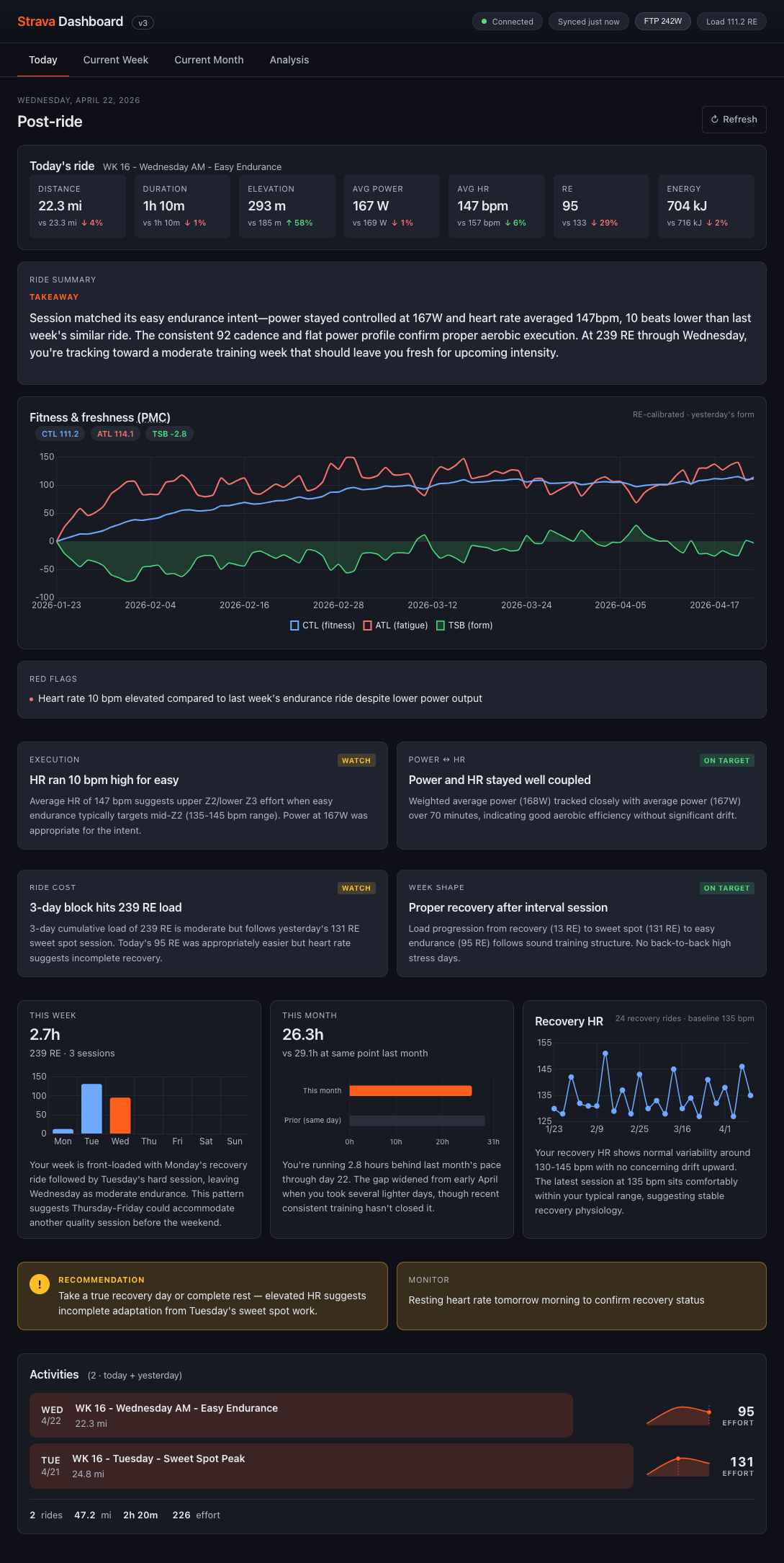
The post-ride loop was the same every time. Open Strava, check the Fitness & Freshness graph — did the line go up or down? I liked seeing three months of context but I never really knew what the line meant. Shouldn't it always be going up? Then into the ride itself: summary tiles top-right, then the analysis stack — Speed, Power, Heart Rate, Cadence, Relative Effort, Power Curve, Zone Distribution.
The charts were clean. They just lacked context.
// Data under the hood
| Metric | Value |
|---|---|
| Rides logged | 4,905 since 2020 |
| Miles ridden | 42,680.7 |
| Last year | 8,495 miles |
| FTP test | every 6–8 weeks |
Diagnosis
Strava's mobile AI tried to fill the gap and mostly didn't. The observations repeated across rides, the tone stayed generic — broad commentary rather than anything that knew me or my week.
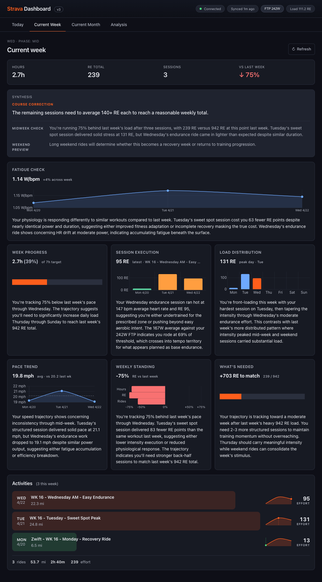
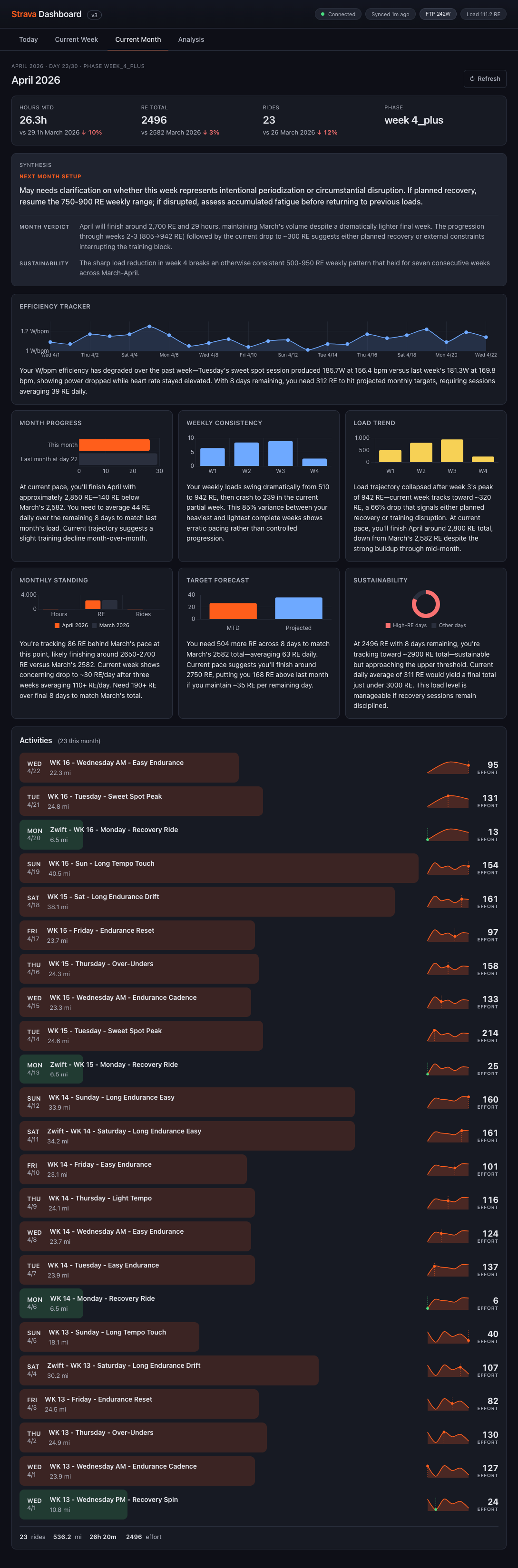
The deeper problem was that a single ride raises questions its own data can't answer. How did this ride fit the fitness I've built? How does today compare to the same day last week — Tuesday against Tuesday, not Tuesday against Saturday? Am I tracking to the week's shape? On pace for the month? The ride is where the questions start, but the answers live at different time horizons.
No single screen can carry all of them, and cross-referencing charts to assemble even a guess wasn't a read — it was work.
Structure · The ride is the anchor. The tabs are zoom levels.
One tab per horizon, no overlap. Open the tab that maps to your question, read the answer, close the tab.
// Four horizons · one read each
| Tab | The read | Horizon |
|---|---|---|
| Today | The ride itself, read against recent context. Did it land? | Day |
| Current Week | Where today sits in the week's shape. Tuesday against Tuesday. | Week |
| Current Month | Whether the month is tracking to target. | Month |
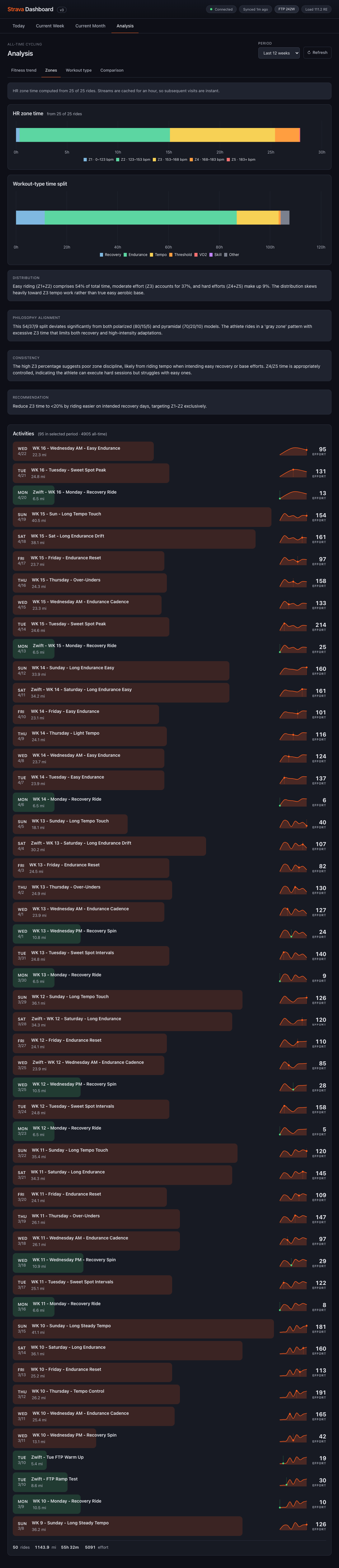
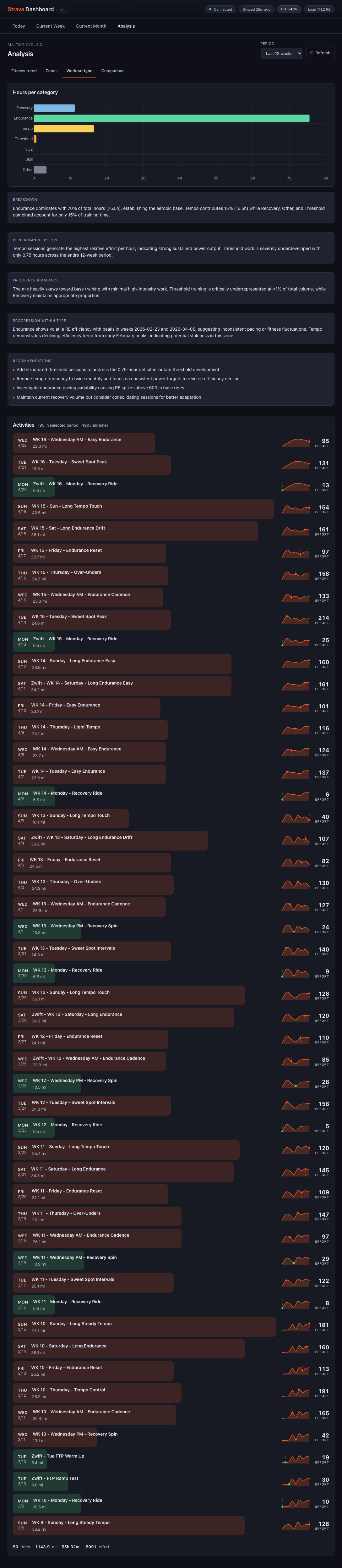
| Analysis | The 12-week pattern the month is part of. | 12wk |
Craft · Four decisions made the structure work.
4.1 — Synthesis as first-class content
Charts answer what. Written synthesis answers so what. The syntheses are specific, reasoned, and written to be read once — they assume the reader can handle nuance and show the reasoning alongside the read.
The rule I was designing against was Strava's AI failure mode: if the synthesis could be cut and pasted onto any rider's week, it wasn't doing its job. I wrote the first two weeks by hand to lock the voice — coach-in-your-ear rather than analyst-in-a-deck — then handed off to an LLM with those examples as style anchors.
"Tuesday's sweet spot session cost you 63 fewer RE points despite nearly identical power and duration, suggesting either improved fitness adaptation or incomplete recovery masking the true cost" — rather than "you're adapting well."
4.2 — Reading order as the real design surface
Each page resolves to a decision through an ordered read. Today opens with a takeaway, then the PMC, then red flags, then paired diagnostic cards (Execution, Power↔HR, Ride Cost, Week Shape) tagged Watch or On Target, then context modules, then a recommendation. The synthesis doesn't sit on top of the charts — the page is ordered so the charts become evidence for the sentences above them.
The reading order shifts with time. Current Week on a Wednesday reads COURSE CORRECTION because there's still runway to change the back half of the week; Current Month on day 28 reads NEXT MONTH SETUP because the verdict is already written. Same tab, different question depending on when you open it.
4.3 — Relative Effort as the common unit
Every comparable metric had gaps — power meters die, Zwift calibration drifts, hardtail weekend rides have no W/kg. I standardized on Relative Effort, a normalized score from HR and duration, and made every chart load on RE first. Power and W/bpm became optional secondary layers.
RE compresses intensity — a 200W sweet-spot hour and a 170W tempo hour can score similarly. That nuance moved into the synthesis layer, which is the right place for it.
4.4 — Analysis as the long-memory tab
Twelve weeks is long enough to see a block, short enough to still be actionable. Four sub-views: Fitness trend, Zones, Workout type, Comparison. Workout type is the one that earns its keep most consistently — it surfaces what's missing, not just what's there. A recent read: 70% Endurance, 15% Tempo, under 1% Threshold. That gap is invisible in any single week's data and obvious across twelve.


Build · Solo, end-to-end, with Claude Code.
The build was solo, end-to-end, with Claude Code. Design decisions and implementation decisions stayed in the same head. The synthesis rule survived contact with the codebase because there was no handoff to lose it across — when a chart didn't earn its sentence, I could cut it the same afternoon I noticed.
Humans set the taste, models scale it. The handwritten two-week corpus was the taste layer; the LLM implemented and iterated against it.
A personal project was the right vehicle because the question — what does a data product look like when synthesis is the object? — needed someone acting as designer, user, and coach at once, running the loop daily without a brief.
What it feels like now
It's the first thing I open in the morning after a ride, and the first thing I check before one. The old ritual — Fitness & Freshness, then the chart stack, then guessing — has been replaced by a new one: the Takeaway paragraph, then the charts if I want the evidence.
The clearest version of this. Five synthesis blocks — Overview, Progression, Effort Distribution, Volume & Consistency, Coaching Synthesis — sit between the comparison bars and the activity list. I read the paragraphs first. The bars become reference material, not the read.
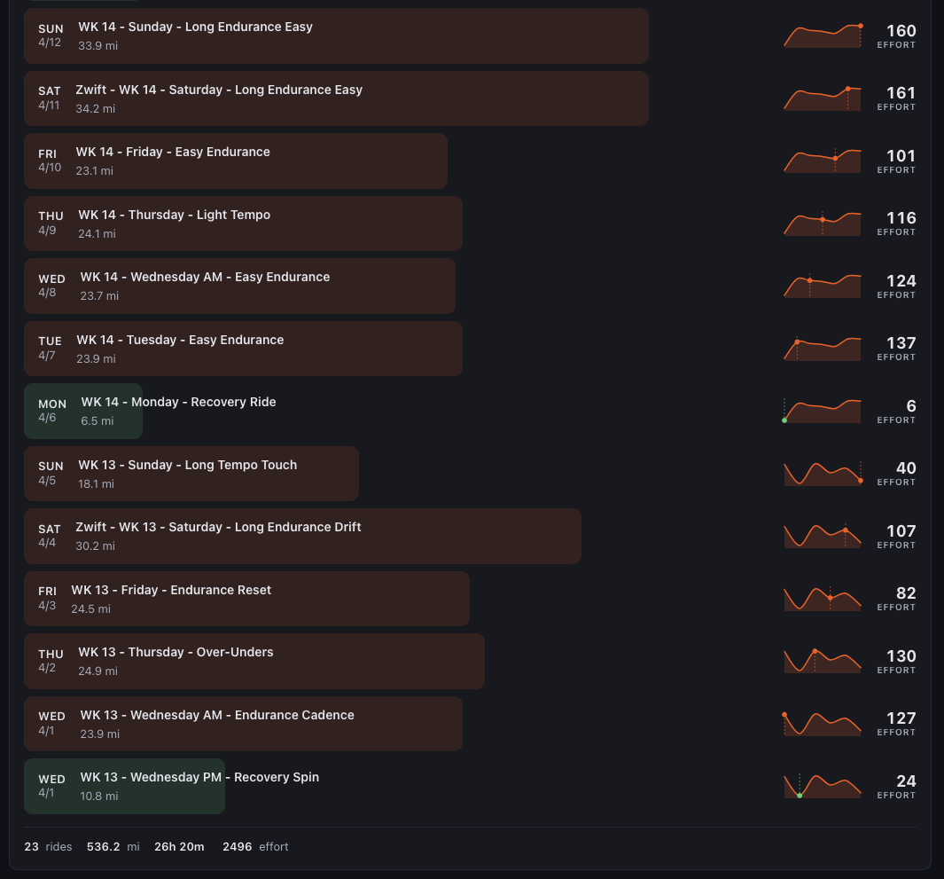
Beneath every synthesis view the raw activity log is always there — day by day, ride by ride, with effort sparklines and RE scores. Synthesis frames the data without hiding it.
Reporting · Three lenses on the same data
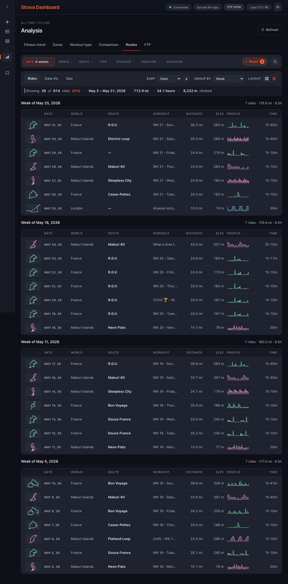
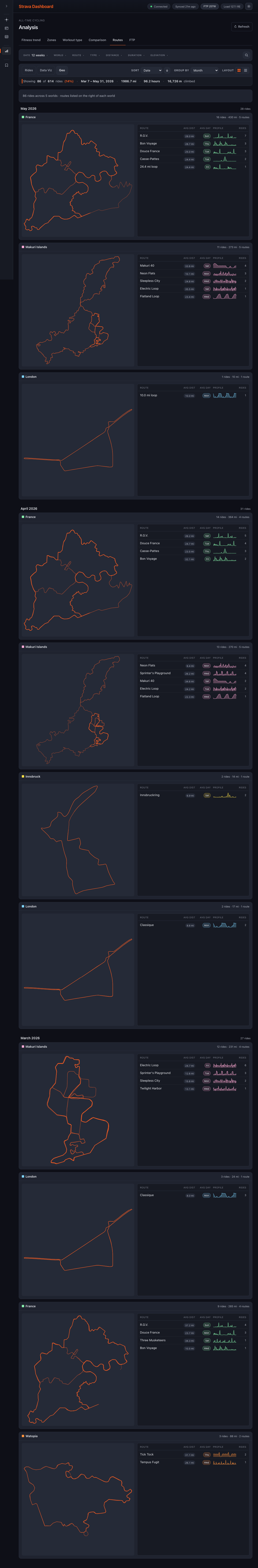
Beyond the four horizons, three reporting views sit alongside the Today/Week/Month/Analysis stack: a sortable rides log, an aggregate data-viz tab, and a geographic view. Different questions, same data — click any image for the full view.
Rides is the long log — every activity grouped by week, with profile sparklines and sort / filter at the top.
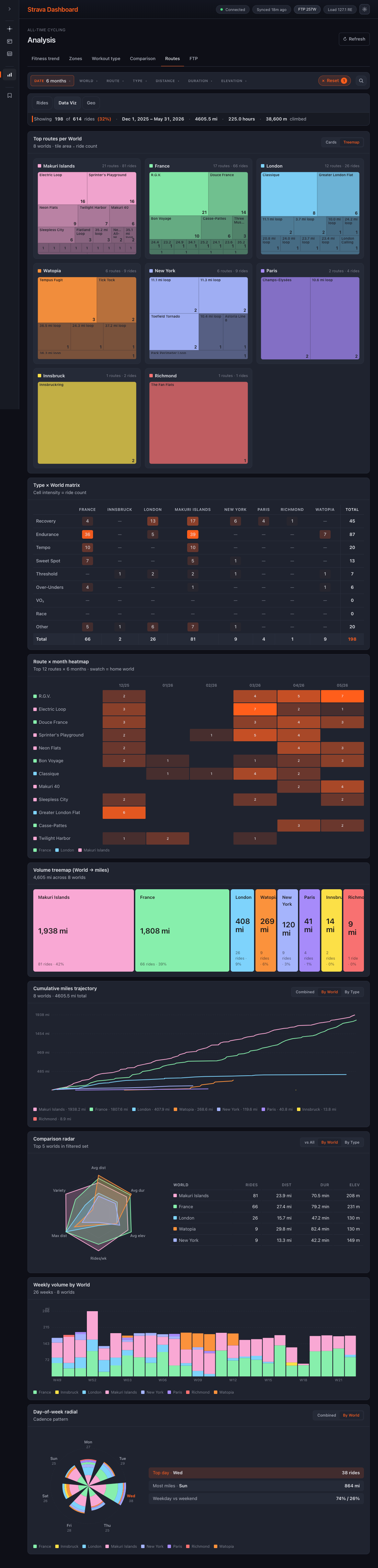
Data Viz is where the synthesis-first rule meets aggregate analysis. Treemaps, heatmaps, radar comparisons, and cumulative trajectories — each visualization isolates a single pattern across worlds and time.
Geo plots each route by location and groups them by month. The world's signature shape emerges — the routes that recur, the ones that disappear, the new ones that arrive.
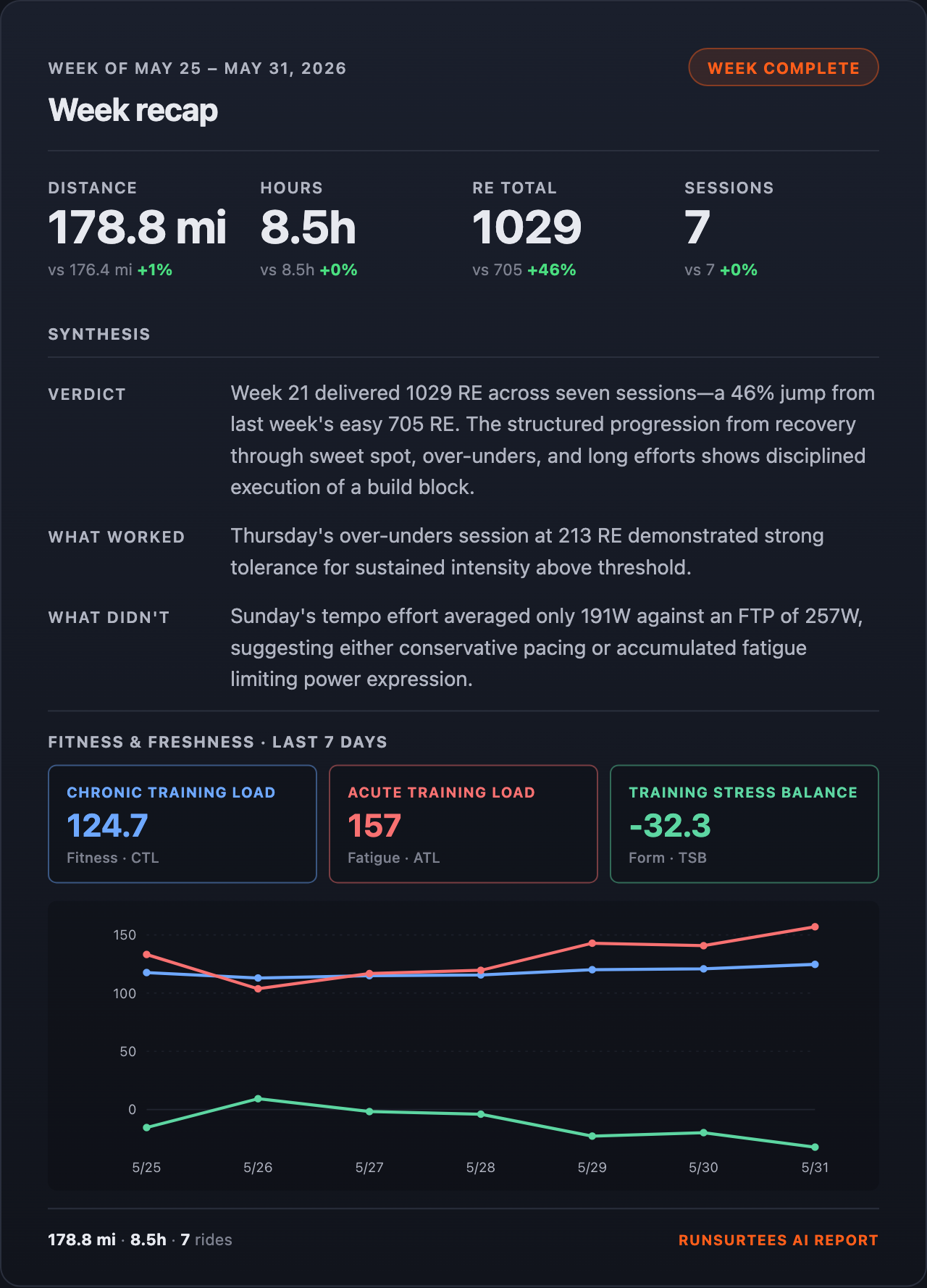
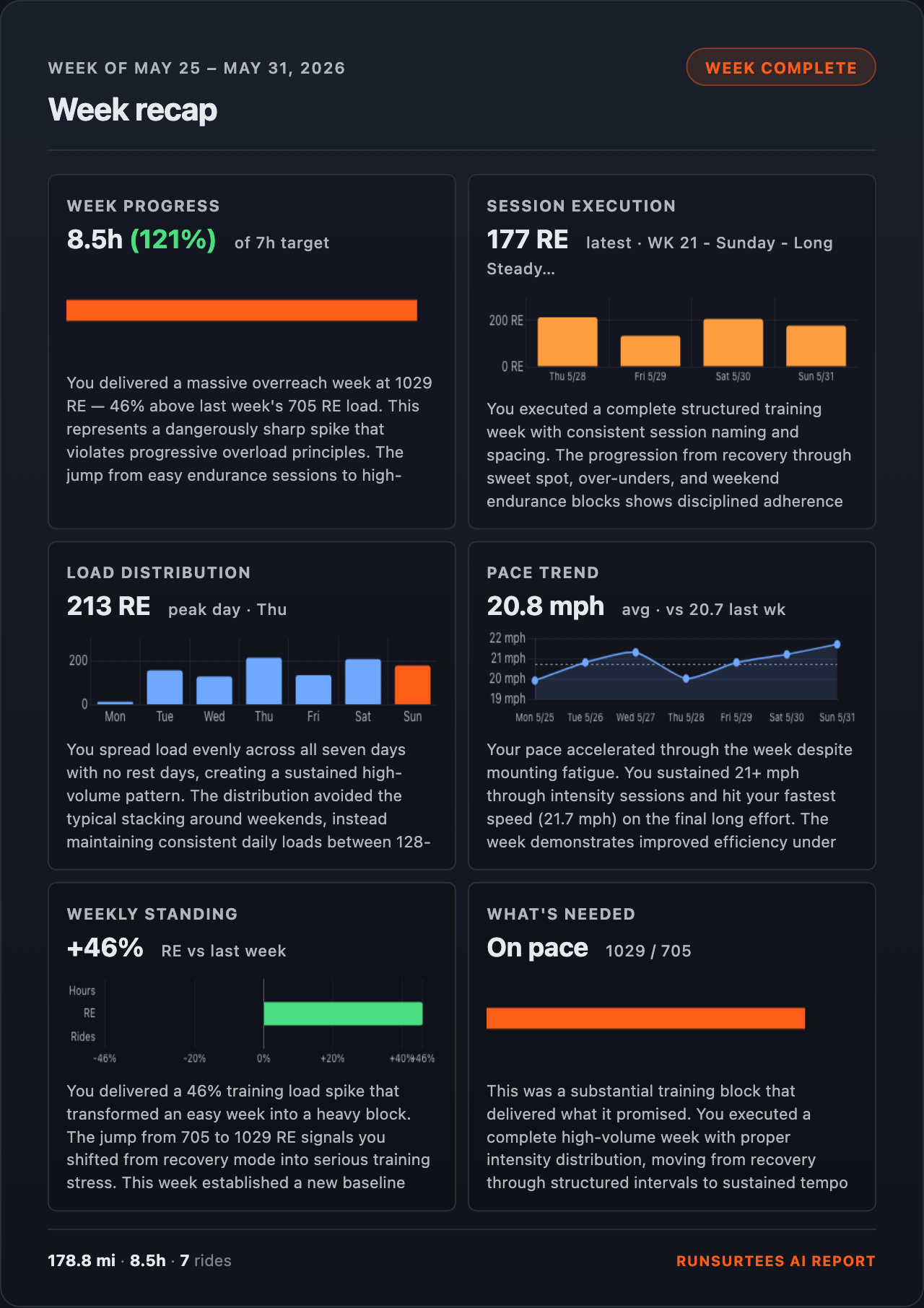
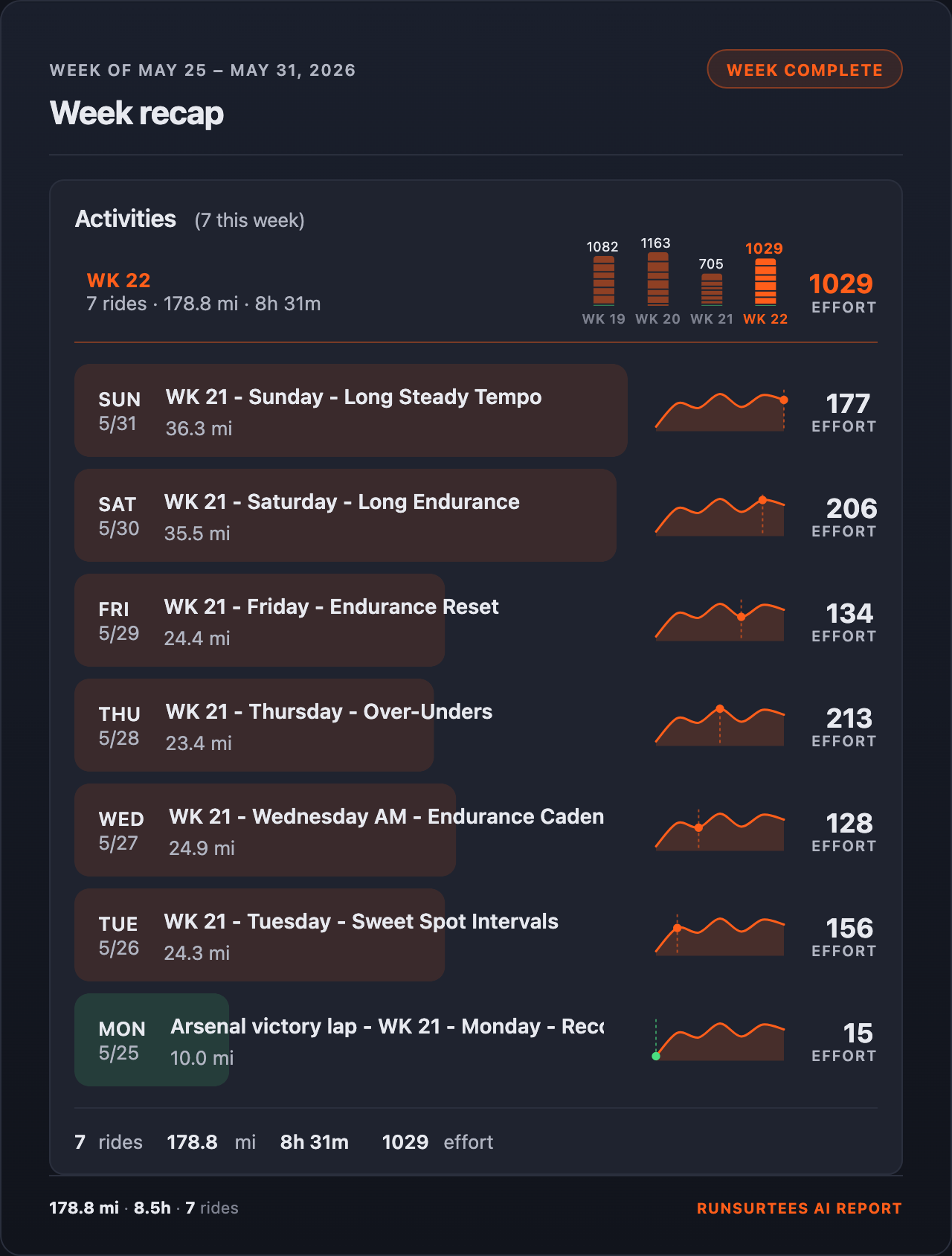
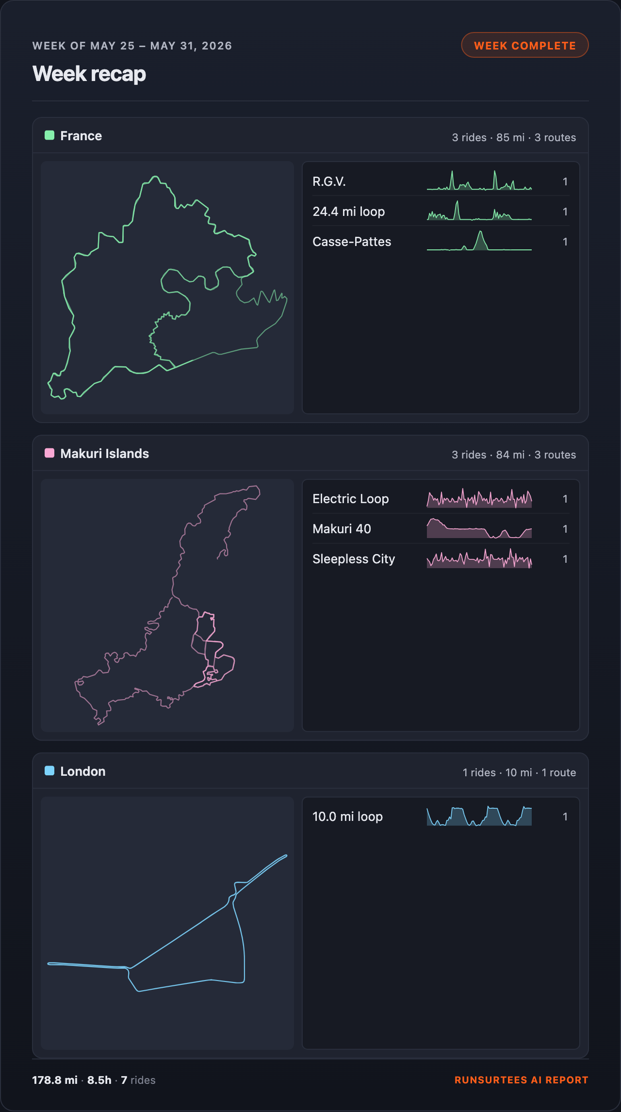
Weekly Report — one-click recap to Strava
After every Sunday ride, one click generates a seven-day recap and uploads it to Strava. Four views of the same week: the regions ridden, every activity scored, six synthesis cards, and a fitness/freshness narrative with CTL/ATL/TSB.
What's next
- Whoop integration — pull recovery, strain, and sleep data alongside ride load, so the synthesis can read physiological readiness against training demand rather than inferring it from HR alone.
- Additional analysis metrics — deeper cuts in the 12-week view: efficiency trends by workout type, fatigue-adjusted power, zone drift across blocks.
- Experimental data visualizations — prototype surfaces for patterns the current charts flatten. Same synthesis-first rule applies: if a new visualization can't earn a sentence, it doesn't ship.