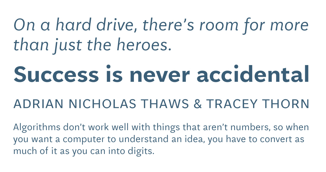

I spend a majority of my time reading on screen, whether it’s on a Retina display or a monitor with a lower resolution. What drew me immediately to wanting to read text in Aften Screen was how easy the typeface was on my eyes. Aften Screen doesn’t scream “look at me!”, but elegantly combines characters in a subtle and sophisticated manner.
Type testing with words like “city”, “upgrade”, and “renderings” shows how the extended ascenders and descenders fit nicely together and with other characters. By extension, reading with Aften Screen is a great study in flow. One simple example is the lowercase word “supreme”: As the eye surfs over the top of each letter, it seamlessly floats to the next.
Continuing with my type tests, I would drop in long paragraphs of type, short quotes, and the occasional favorite word. As I experimented with different sizes from extremely small to giant, uppercase to sentence case, I was inspired. I wanted to start using Aften Screen for unimagined projects. As a screen-only typeface, I could see how it could be used in many applications. I was really struck by how versatile it could be — from straightforward workhorse applications to long reads. I could see myself using one weight and size for an entire project without it feeling stale. On the flip side, I could also see it being used elegantly with a subtle range of weights and sizes.
Aften Screen is one of those unique typefaces that could be used daily without fear of being lost within too much eccentricity, while at the same time displaying some new aspect of its character in each application.
This review of Aften Screen was originally published for Typographica's Our Favorite Typefaces of 2012. If you're a fan of typefaces and want to see some beautiful cuts, I recommend visiting Typographica to get your type on.