 Reading from Screen to Screen
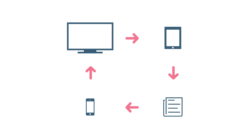
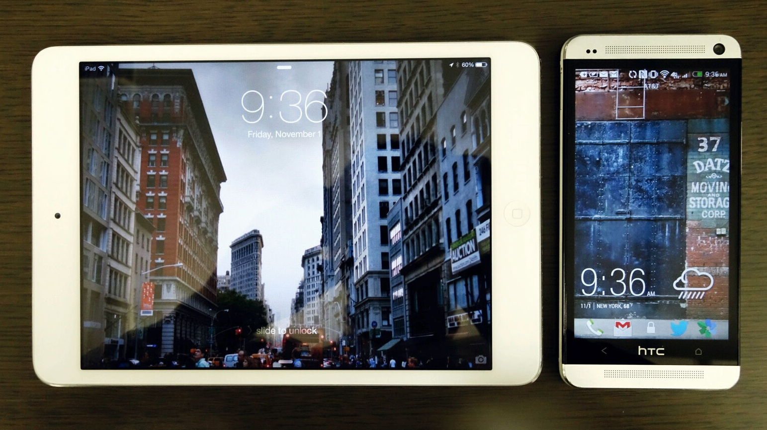
I can’t seem to sit still when I read. No matter where and how I’m reading I wish it was on a different screen. While this isn’t always the case, the flow follows something like this.
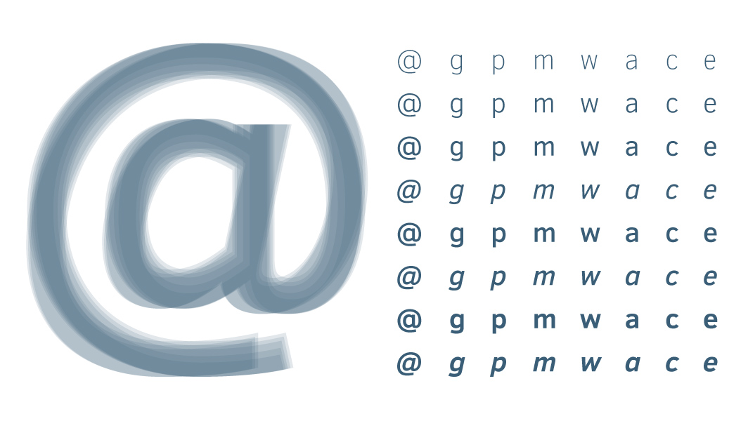
 Review of the Typeface Clear Sans
Having spent time recently focusing on dispersed levels of data, I was drawn to Clear Sans for its practical nature. The different weights between light, thin, regular, medium, bold, and even italic offer great options for both readability and contrast, making all sorts of type and numbers easy for users to digest.
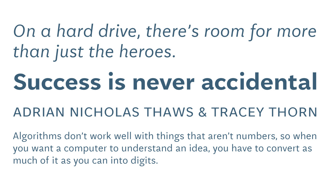
 Review of the Typeface Aften Screen
Aften Screen cuts through the majority of bland screen-only fonts by being confident enough in what it chooses to display as much as in what it doesn’t show.
